

Student Carole Mallatratt has completed the Coloured Pencil Course and you can see her final artwork and below along with the text about the images too. We would like to wish Carole all the best for her future drawings and paintings!
As this is my final submission I wanted to say a big Thank You to you Monika for her encouragement and guidance. She has been a great help and I’ve gained so much more confidence than I had expected. My drawing and use of colours has really improved and I’ve learned a great deal in regard to drawing material, fur, fruit and objects of all sorts. I feel more inclined to have a go at something rather than brush it away if I thought it was too challenging so many thanks again.
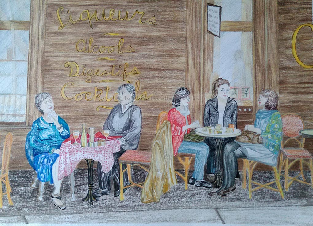
People in a scene – The Street Café (Source – The Huffington Post) I chose to use A3 Winsor and Newton, smooth paper. I also selected my Verithin pencils and Derwent Blender Pencils. Time taken is almost 8 hours. This photo attracted my attention and I felt I had to take on the challenge of at least having a go. The fact that I am now sending it to you, is down to the confidence that you have drawn out of me. This was a real challenge for me, but I kept on at it until I was happy with the finished work. The drawing alone took almost 1 ½ hours, but I was glad that I spent so much time on it, it meant that the end result was much better than I had hoped. I’m very happy with it. There were a few moments where I thought I had spoiled it, but with a good putty rubber in my hand, I persevered. I liked the natural element of the people having their coffees, and being able to draw them, in all the detail as well, made me feel more confident in my work. The difficult bit was the faces of the people. They were too far away for much detail and I wasn’t sure how far to go with them.
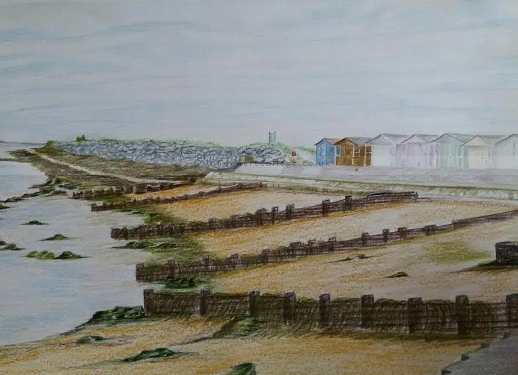
Tyneside Beach Scene – source photo is one of my holiday snaps. I chose to do an A3 picture of the beach. I selected the Winsor & Newton paper and my Verithin pencils. It took a little over 6 ½ hours to complete. Drawing this took a lot longer than I expected as there was so much perspective to consider. The beach huts perspective was different to that of the wooden barriers. The barriers were in an arc shape before straightening out into a long shoreline, so that took some working out too. But in the end I got a good drawing to work with. I was very surprised at just how many colours I created. I was surprised that even the sandy shoreline took 4 or 5 colours, more than I had anticipated, but I was able to successfully blend the colours I was looking for. I was particularly happy with the sand effect I was able to create and the completed beach huts.
I have used the smooth Winsor and Newton A3 sized paper for this final picture. I chose to use my Prismacolor pencils and pencil blender. This took me over 9 hours to complete and was my favourite of these 4 completed tasks.
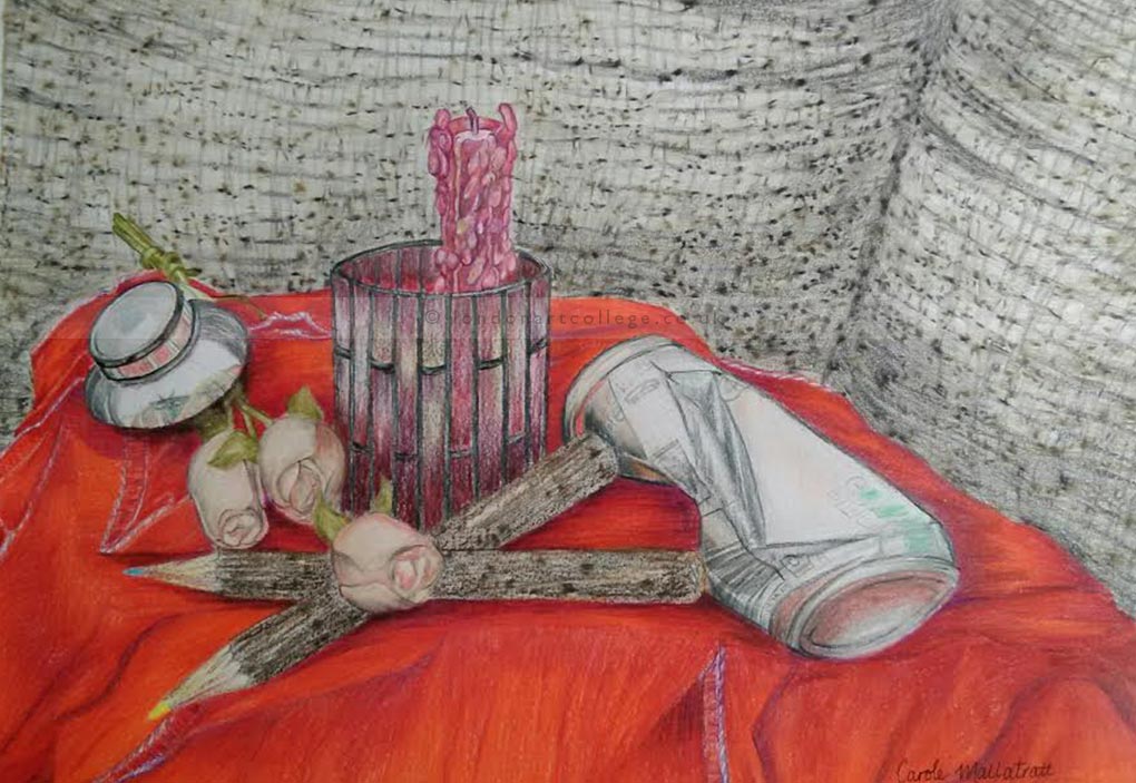
As I wanted to give myself something to chew on, (at one point I thought I’d chewed off too much!), so I looked around the house for a few items that would be of interest and different materials. I finally went with the following, wax, glass, metal, fabric and wood. Drawing out the arrangement was very time consuming, but not as long as I had anticipated, however it did take much longer to complete.
I spread some red linen napkins over a cushion and put them on my settee. Then I added the candle in its holder, the wooden flowers, metal oil well, aluminium coke can (crushed) and finally added the coloured pencils, which are made from twigs that still have their bark on.
I used an enormous range of colours for this painting, and I created many more with blendings. I was happy that I got the folds on the fabric as well as where the napkins can be seen to overlay each other. I was also happy with the way that I captured the soft corduroy effect of my settee, by using sesame seeds under the paper to create little tufts of colour, similar to the fabric. I took my time with the pencils and created them using 5 or 6 different colours. I’m very happy with them, they’re quite realistic. The wooden flowers were difficult, and again it was surprising how many colours I used on them.
The metal objects were the hardest, but I found that by ensuring that my highlights were vivid, the images looked more realistic. I double checked that I captured the reflection of the flowers on it. I did the same with the coke can, once I was happy with the colours, I ensured that I had the reflections of the napkins showing on the surface of the metal. I made sure that I had captured the angles of the crushed can, by applying the colours in the correct direction. I then added some faded details of lettering and images on the can to give it a more realistic feel.
The glass candle holder worked out well, I applied plenty of colour, made sure it was in the right areas, watched for reflections and shadows and I’m extremely happy with the finished image. The surface is reflective, but not very shiny as there are bits of gold paint on it. The wax was hard to define. But I got there in the end. I checked that I had the many highlighted areas and lifted out extras where needed with magic tape.
If you would like to receive a roundup of all of our blog posts once a week to keep you inspired in your inbox, why not sign up to our newsletter. You can access our sign up at the top of our page. If you are a London Art College student and you would like your artwork featured here, drop us a line at any time.