

Following on from Victoria’s post last week, we have a second in the series of her beautiful and very realistic paintings of Braeburn’s. Read about how Victoria painted them below along with the colours she used and her process.
“Malus Domestica Braeburn: The composition is in a portrait format with the two apples which show a stalk below the other apple. I had one apple and turned it around continuously to see it from different angles while painting.
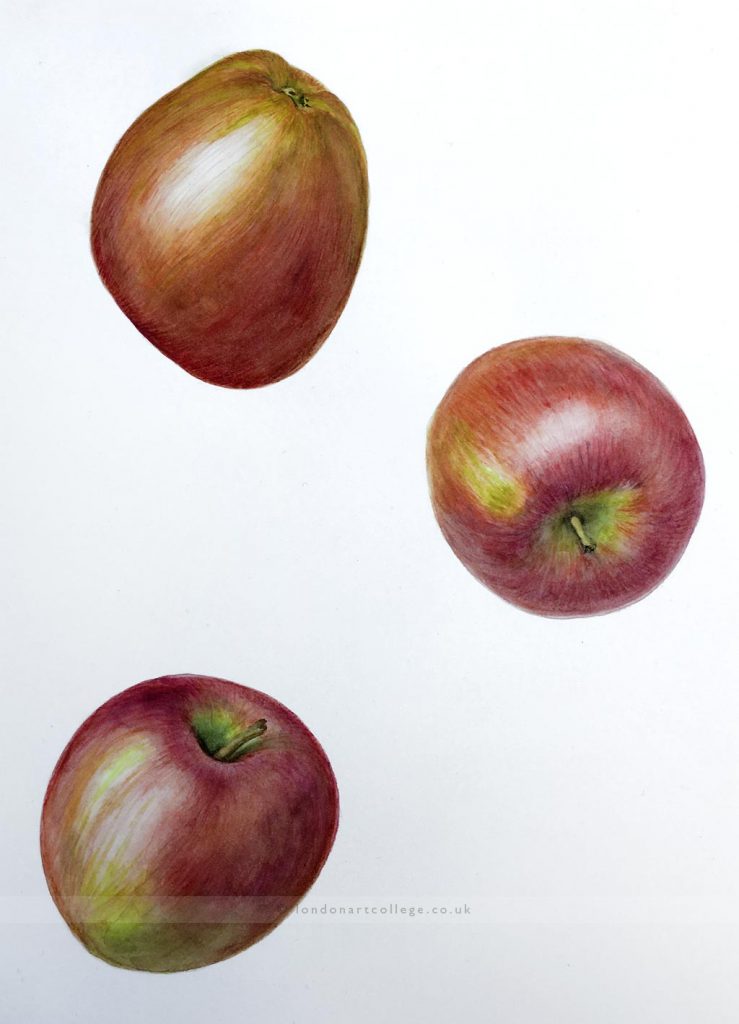
I chose Braeburn apples because they keep well and from these I chose just one apple which I painted from different sides and from different angles. This particular apple had more colour variations than the others which seemed more interesting. The colours – red dominating the apple and some green – were not totally bright, the green even a little bit muddy, with lighter, more yellow, and slightly darker tones.
I began with a glaze of water, leaving out the edges. Into the galze of pure water I dropped a warm yellow (Sennelier Indian Yellow) over most parts and at the same time a warm red (Sennelier red plus some Sen. Lemon Yellow) on the right side. I distributed them with my brush, keeping the whole plane very light and avoiding the area oft he highlight.
Quickly I used a damp, not wet, brush with clear water to pull the colour out towards the edges, so that the edges would remain lighter from the beginning.
Polly had advised me to keep the edges lighter with round subjects, as the edges are further away and therefore seem to be lighter. In fact, although I used the technique described above throughout the process, colour did seem to feel very attracted by the edges and these seemed to build up a lot of colour, thus becoming darker. I was very busy wiping them with a brush while still damp and I also removed some colour with a stiffer brush after it had dried, then reworking the edges to avoid a hard line.
After this initial glaze I deepened the colours with a further glaze and then alternated with glazes and many layers of feathering and dry-brushing to build up colour. When this became too stripy I would glaze again to pull everything together.
I introduced other mixtures of red, mainly Sennelier Alizarin Crimson and later also Sen. Helios Purple, while I introduced a greenish shade to the other parts by mixing Sen. Indian Yellow as well as Sen. Quinacridone Gold with Sennelier Phtalo Green to layer greener parts on top of the initial yellow. Later, where the greens are slightly darker, I also put in a hint of Sen. Red to make the green more olive.
At a later stage I added violet into the shaded parts, first Sen. Helios Purple, then Sennelier Dioxazine Purple in a wet-into-wet-technique, which immediately turned much too purple. But with a layer of muddy green, mixed as above, on top, the shaded parts received a slight greyish-to brownish tone and appeared rather like the original.
Victoria Westmacott-Wrede
Botanical Painting Diploma Course
Ich hätte gerne die wöchentliche Zusammenfassung der Blogbeiträge.
Vielen Dank
Hi Vieven,
We are thrilled you would like our weekly newsletter. Can you see the blue bar right at the top of the page? Pop your email address in here and you will be all set!
Melanie x