Colours have a powerful influence on our emotions, perceptions, and overall well-being. They can evoke feelings of joy, calmness, or even excitement. Therefore they can alter the way a viewer feels when they look at one of your paintings. One tool that helps us understand and harness the potential of colours is the colour wheel.
Before we dive into the meanings of colours, let’s understand how a colour wheel is constructed. A colour wheel is a circular representation of the colour spectrum, which organises colours in a way that visually illustrates their relationships. The primary colours—red, blue, and yellow—form the foundation of the colour wheel. Combining these primary colours creates secondary colours—orange, green, and purple. Tertiary colours further expand the wheel, resulting from the mixture of a primary colour with an adjacent secondary colour.
The Meanings of Colours:
Colours possess unique symbolism and convey various meanings across cultures and contexts. Let’s explore some common associations and emotions associated with each colour:
- Red is often associated with passion, energy, and strength. It can evoke strong emotions and grab attention. In some cultures, red signifies luck and prosperity.
- Blue is often associated with tranquility, trust, and stability. It has a calming effect and is frequently linked to feelings of peace and serenity.
- Yellow represents happiness, optimism, and creativity. It is associated with warmth and can stimulate mental activity and positivity.
- Orange combines the energy of red and the cheerfulness of yellow. It is associated with enthusiasm, creativity, and warmth. Orange often symbolises excitement and adventure.
- Green is associated with nature, growth, and harmony. It represents balance, renewal, and fertility. Green can have a soothing and refreshing effect on the mind.
- Purple is often associated with royalty, luxury, and spirituality. It represents creativity, mystery, and wisdom. It can evoke a sense of enchantment and inspire imagination.
The Opposites on the Color Wheel:
Now, let’s delve into the intriguing concept of opposites on the color wheel. Colors that are opposite each other on the color wheel are known as complementary colors. These pairs create a striking visual contrast and often intensify each other when used together.
The reason behind the placement of complementary colors stems from color theory and the way our eyes perceive colors. Complementary colors exist at opposite ends of the color spectrum and have distinct wavelengths. When these colors are placed side by side, they create maximum contrast and vibrancy, making them visually appealing.
For instance, red and green, blue and orange, and yellow and purple are complementary colour pairs. Artists and designers often leverage this phenomenon to create eye-catching combinations in their work.
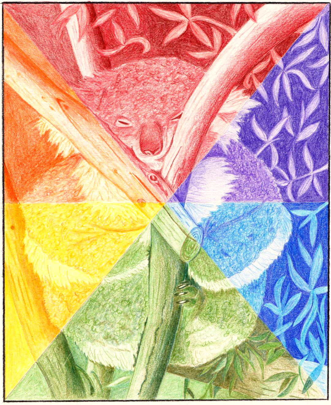
Clare O’Neill’s Koala Colour Wheel
Clare O’Neill, has crafted a wonderful colour wheel. Instead of using conventional blocks of colour, Clare drew a beautiful koala bear and divided it into six distinct sections. Each section represents a colour on the colour wheel. With meticulous attention to detail, Clare used varying tones and shades to colour the koala, effectively creating a colour wheel within the drawing itself. This imaginative approach not only showcases her artistic skills but also adds depth and meaning to the colour wheel concept.
Clare O’Neill’s unique interpretation of the colour wheel with her koala drawing showcases the boundless creativity and possibilities that exist within the realm of art. It serves as a reminder that the colour wheel can be a canvas for imagination, allowing us to tell stories, convey meanings, and explore the rich tapestry of colours that surround us.
So, let your creativity flourish as you explore the diverse hues on the colour wheel and experiment with the dynamic interplay of complementary colours. Embrace the language of colours and let them infuse vibrancy and meaning into your world. Remember, the colour wheel is a guide, but it’s up to you to paint your own masterpiece!