

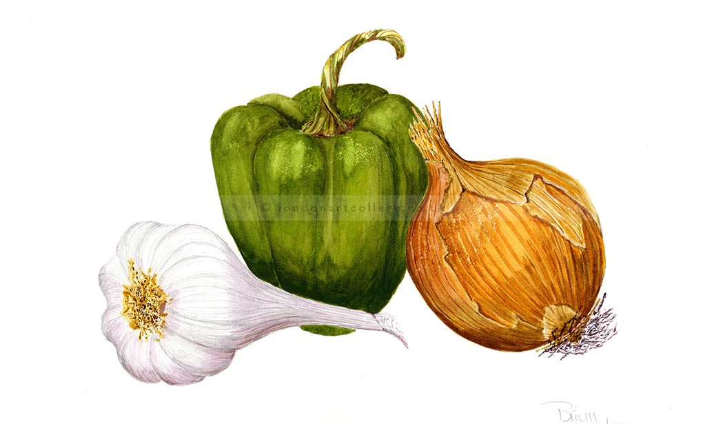
After a lot of deliberation I managed to come up with this painting of the red pepper/ onion and white garlic. I am still using my favourite paper Fluid 100 hot press 140lb/300gsm 12” x 16” because I feel comfortable with it.
I have tried several times the Saunders Waterford Classic, HP Le Grain Satine, High White, 100% cotton, 300gsm 12” x 16” and also Stonehenge Aqua hot press, 100% cotton, 300gsm 12” x 16” but have found the surface
breaks down on both of them and goes ‘fluffy’. So I will stay with the devil I know Fluid 100. All my watercolours are Sennelier l’Aquarelle tube colours, all except a couple are transparent.
I think that the composition is OK, using three objects to give it some sort of stability. I purposely made the highlights on the pepper subdued as I was not in favour of extreme highlights at the time but maybe I was wrong looking at the finished painting as the pepper seems to be a bit heavy. The onion is just about alright it could have been a bit more delicate. I am really pleased with the way the garlic has turned out. Being white was a bit of a problem as white flowers/veg are always a problem as far as shadows but I did my homework and after many many tries and wasting a lot of paper I think I have got it right. I am also reasonably pleased with the cast and other shadows.
Colours Used – all Sennelier l’Aquarelle
Alizarin Crimson 689 Transparent PR209,PY 83, PR 179
Cobalt Blue 307 Transparent PB28
Warm Sepia 440 Semi Opaque PBr7, PBk7
Olive Green 813 Transparent PY150, PG36, PBr23
French Ochre 565 Semi Opaque PY3, PY150, PBr23, PBr7 Blue Indanthene 395 Transparent PB60
Aureoline 559 Transparent PY53
Blue Violet 903 Transparent PV15
Carmine 635 Transparent PV19
Permanent Magenta 680 Transparent PV19 Yellow Ochre 252 Opaque PY43
Indian Yellow 517 Transparent PY154, PY153
Raw Umber 205 Transparent PBr7
Burnt Sienna 211 Transparent PBr7
Raw Sienna 208 Transparent Par7
Quinacridone Gold 599 Transparent PR101, PY150, PR206
Painting No 2
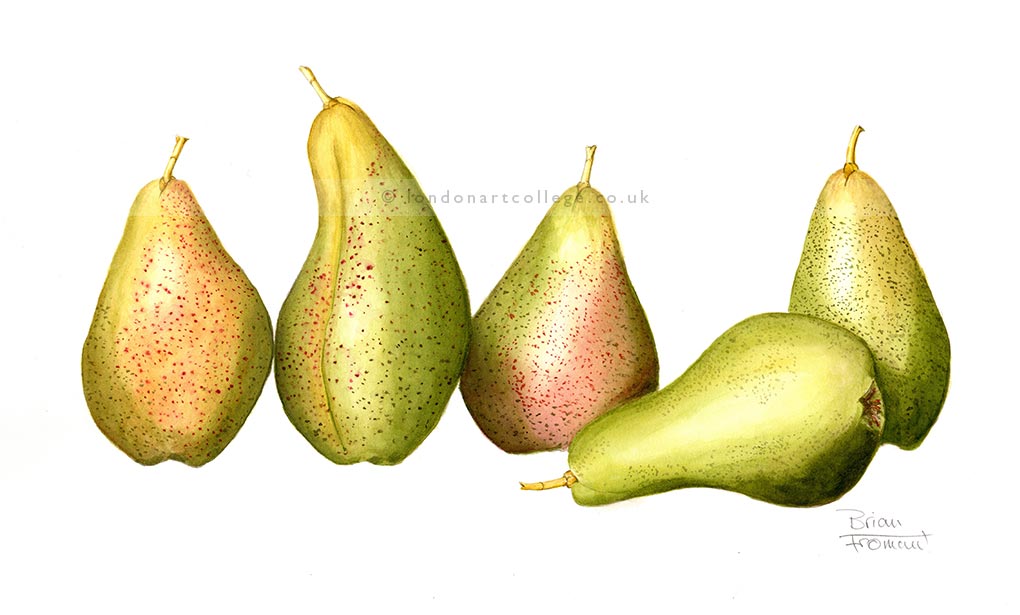
5 Forelle pears or sorry couldn’t help it but I named them grumpy, dopey, Doc, Happy & bashful;) well the other two – yum yum! Really enjoyed painting the pears through their ripening process using wet in wet layers for the under painting. Shadows worked well as I have taken note on your last critique about strong light coming from the top left hand side as with all Botanical Illustrations. First time that I had really used layers to the full effect. Plenty of practice on scraps of paper helped. The composition ‘just happened’ say a fortunate accident.
Colours Used – all Sennelier l’Aquarelle – French Ochre, Sap Green, Yellow Ochre, Aureoline, Warm Sepia, Burnt Sienna, Permanent Alizarin, Carmine, Burnt Umber, Olive Green, Warm Sepia, Cobalt Blue, French Ultramarine*, Alizarin Crimson*, Lemon Yellow*, Scarlet Lake**, Blue Indanthene**, Indian Yellow**
Brian Fromant
If you would like to receive a roundup of all of our blog posts once a week to keep you inspired in your inbox, why not sign up to our newsletter. You can access our sign up at the top of our page. If you are a London Art College student and you would like your artwork featured here, drop us a line at any time.