Tutor Vanessa weaver asked if we would share student Julie Noonan’s logo design from one of her assignments. It is an idea for a charity, although it’s not an actual brief, the company does exist and the student decided to redesign the current logo.
Julie wrote to her tutor Vanessa Weaver…….
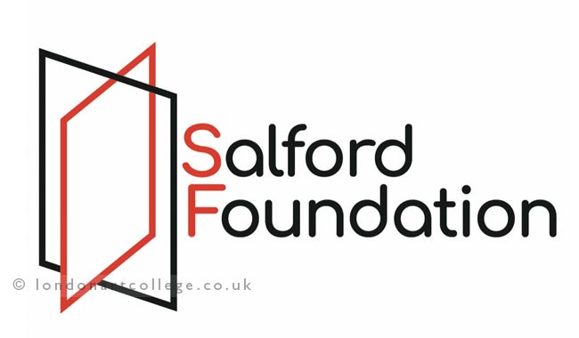
For this task I chose a local charity – the Salford Foundation – who work with young people and adults to increase opportunities. Their tagline is “Opening doors to opportunity” and their existing logo incorporates a key, and is quite busy and not very eye catching.
The Salford Foundation have quite strong branding in terms of using their colour scheme, so I was fairly sure I was stick with their red as my colour.
Picking up on the opening doors idea from the strapline, I began with what is very clearly a door, and rapidly became a much cleaner more conceptual version of a door. I played about with the shapes long enough to know that this was my preferred option. Once I had worked out the angles for the two shapes, I then worked out which line needed to be on top of which to make the perspective work and give the impression of a door (rather than just two shapes).
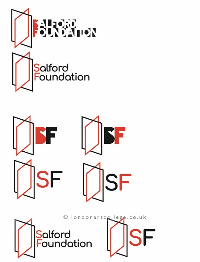
I started to work on how the charity name might be incorporated. The first typeface was quite fun, but I thought a little hard to read and didn’t have the clean, modern feel I was aiming for. I also worked up version using just the initials: it is quite a long charity name, and I thought an alternative version that would be more compact might be helpful to the charity.
The final full version of the logo is found below.