The following has been written by tutor Vanessa Weaver…
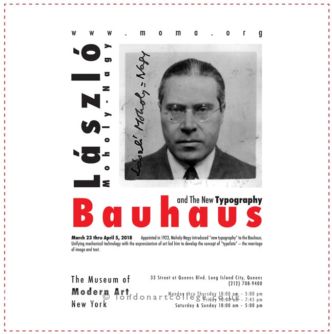
I have a student on the Graphic Design Art Course who has submitted a lovely piece of work that really demonstrates the maxim ‘less is more’. It is always so tempting to try to fill most of the available space within a design. However, white space (the unused part of a design with no text, images or graphics) can be extremely useful in allowing the content to ‘breathe’.
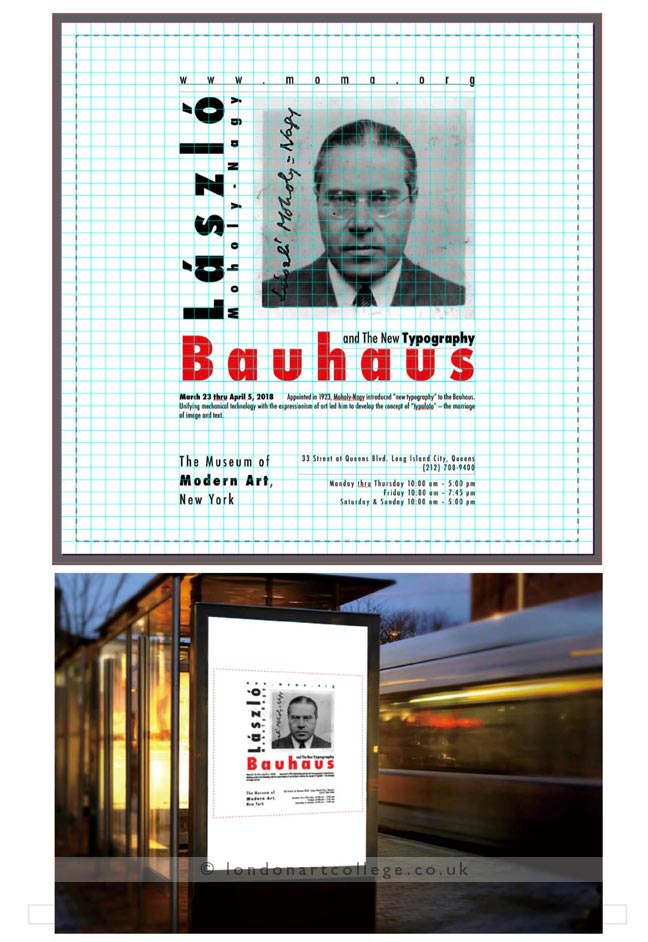
This principle has been demonstrated by Lan Qian. The work below shows a poster proposal for a Bauhaus exhibition, along with a wonderful visual explanation of how each element has been carefully positioned within it. The amount of white space allows the viewer to absorb the content with ease. Also, there is terrific consideration of the layout.
In the second image, this is shown in the form of a grid, which has been used to align the text and photograph. Using an invisible series of lines to position each aspect is most effective in graphics and creates cohesion within a design. In brochures and leaflets, the use of a grid ensures consistency throughout. Lan Qian’s work is a wonderful example of carefully crafted type and image. She has also shown how the poster would appear in context.
Lan Qian
Graphic Design in Art Diploma