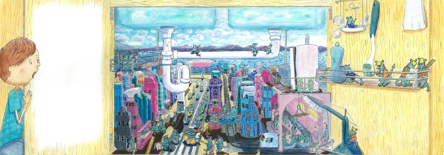
We are thrilled to be able to show a Sebastians Sink City illustration on our blog today written and illustrated by student Priscilla Hocking.
From my first assignment, I came away with the understanding that I would have to be very careful to stick to the brief. I find it easy to read and understand the instructions but then creativity and sketching and imagination can lead me away from the original requirements. So this time, I was determined not to miss any of the requirements in the brief. I underlined all the relevant words and kept going back to them. (Older children, text on one third of left page, landscape, detail, cartoony, good use of scale).
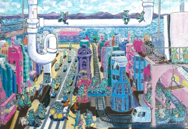
I found the scale one of the biggest challenges. I knew that it was important to get the sense of it being a sink cupboard and so I wanted to include the u bend pipes and the sink basins which meant getting the whole cupboard in. In aiming for a good sense of scale, I decided that meant that an alien should look the right size compared to a “building”. To look like a city, I decided a building should be at least 3 stories high. Each story or floor had to be taller than an alien/monster which meant that the aliens really ended being very tiny indeed. However, being for an older child, I thought that this lent itself to a “Where’s Wally?” style of drawing, where the viewer can really spend some time looking over all the details and discovering what was on the pages. Perhaps, in a real book, there would be other opportunities for close-ups of the aliens.
To know that something is a city, I think you need lots of tall buildings. When looking at a city scape, something rather attractive is the sense of size and depth you get with an aerial view, with streets and building continuing and disappearing into the distance. Because of the this, I decided to do a reasonably accurate perspective drawing. The brief talked about having a cartoony edge but I thought this could come through with the drawing style even if it had a realistic depth to it. Even though Sebastian is a child, I decided he would be looking from above rather than on his hands and knees, so I decided a high angle view could work, which also helped with the idea of looking in at a whole City.
I’m sure most people check out their own kitchen sink, although I’m not sure that everyone pulls every single item out of it. When I opened the doors to have a good look, I felt my cupboard looked more like a jungle than a city! I couldn’t get much sense of the size of it without some major rearranging. I was pleased I did though because it helped with finding ideas for kitchen items and what they would be in an alien city.
I was happy with my line drawing, the sense of depth, the details and interest with the activeness and busy-city feel of the aliens. Although it was a lot of work, I enjoyed it, apart from a few hiccups with perspective and cupboard doors.
So far so good.
On the downside, I don’t think I managed my colours and the shading as well as I could have. I think I may have over-thought it all. I had decided on a morning scene as I liked the idea of some alien children being out and about as well as business-aliens on their way to work and grabbing a coffee. Because of this, I wanted morning light. I decided initially that really only left the chance for light to be coming from the back of the cupboard which meant shadows coming toward the viewer. However, because of the tall buildings, a lot of the aliens are already in shadow which means not much interest was added to their shapes. I liked the Narnian idea of a world extending beyond the back of the cupboard. Because of the light situation I decided to really have the cupboard like a window and the side and top edges not really being there. I spent a lot of time looking at shadows in 1 and 2 point perspective.
A lesson learnt from this assignment for me is to think about the light source before I start anything so it is part of the whole artwork, not as an afterthought to the linear aspect.
Priscilla Hocking
Illustrating Children’s Books Diploma Course