

Jane Tivey chats about how she completed her landscape hay bales pastel painting. We hope you all find it interesting and inspiring!
To start with I roughed out the tree line and top field line and then painted the sky using some a couple of blues, greys and a little white. I selected the pastels to use by practising first to work out the best ones to use trying to keep it to two or three rather than heaping on lots of different blues!!
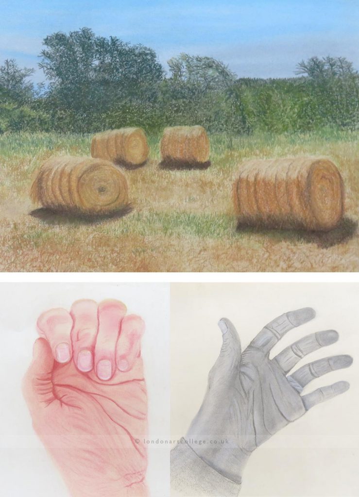
When I was satisfied with the sky I moved on to the trees and hedges. These were more difficult and it took me some time to work out the best colours and ‘strokes’ to use. I started from my left with the tallest trees, roughing out their overall structure and then, using a darker green,’ filled’ them in working across and down. I then used some lighter greens and browns to give them more shape and tones. I carried on working across and down to the bottom of the trees/hedges.
Once I was reasonably happy with the trees/hedges I concentrated on the field and hay bales. I laid down a sandy colour as the base for the field and hay bales and then sketched out the shapes and positions of the hay bales. I spent quite a lot of time practising how to achieve the hay bale texture. This was made more difficult (for me anyway) as I couldn’t get much detail form the photo. Usually I can zoom in and get an understanding of the underlying structure of objects which helps me work out how best to draw them. When I felt I’d got the best method – sort of crisscrossing and ‘s’ marks using ochres and terracottas and umbers I moved on to the actual drawing. The shadows were hard to do; due to the unevenness of the ground and the hay bale itself. I also noticed that the grass from the field was reflected in the shadow under the hay bale. The highlighted areas on the top of each hay bale was accomplished by using an eraser to lift the colour. I did try using a much lighter colour but it just didn’t give the same effect.
When I thought the hay bales were as good as I could get them I attacked the field. This was not too difficult once I sorted the colours out. Simple strokes with the side of the soft pastels seemed effective augmented by marks with conte pastels or sharp edges of a soft pastel or pastel pencil.
Having completed all the areas I then reviewed the drawing and added more detail where I thought it was appropriate.
I was fairly pleased with the finished picture considering how challenging I had found it. I did realise that the hay bales weren’t in quite the right positions when I was part way through. I debated whether to start again to position them more accurately but decided that I had put too much into the picture so far and as an overall composition I felt it still worked!
Paper used: Cream Canson Mi Teintes – smoother side. The size of the drawing is 38cm wide by 29cm deep. Pastels used: I used a selection of soft pastels including SAA and Unison soft pastels.
Jane Tivey
Pastel Course