
Charlie Leith has written a wonderful analysis of some logo designs and we felt it would be very interesting for students to read. We hope that you enjoy it!
My first selection of logos are well known brands in the ares of technology and the internet; toys; products and places and food and drink. All of these logos are well designed and successful in representing the company or product they were designed for. The predominant colours are black, red and blue with some green and yellow and one brand makes a success of it’s use of pink and orange – not an easy feat. I found it interesting that the majority of the fonts used in these logos are sans serif of handwritten. I think that the designers knew that the clean lines of a sans serif would be more legible at all sizes and quick to read. Any hand written fonts seemed confined to toys or food and drink and are easy to read and pleasing to look at, they also tell the customer that this company is personal, friendly or perhaps bespoke or hand made.
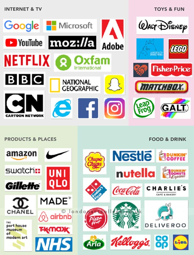
Some logos that I feel are particularly successful include the Amazon logo with it’s one-word, approachable lowercase typography and arrow which represents quick delivery and a smile (friendly service). The Netflix logo manages, with a clean straight font, lower curve and striking red colour, to make you think of cinema or theatre curtains or Hollywood letters. It’s incredibly simple and subtle in the message it tells it’s customers.
The Adobe logo is very iconic and unmistakably the work of the great designers – like the one’s that use it’s software. Other iconic logos include National Geographic with it’s simple rectangle outline and well-balanced text. You can’t miss the Lego logo, it’s simple, contained in a brick-like square (a 2×2 piece), has a balloonish and friendly font and bold primary colours designed to say ‘I’m for children’. The Nike symbol is now so well known and iconic there’s no need to words or letters. It’s a swish that could represent the trajectory of a leap or the go-faster swoosh of a running rushing past in some rather snazzy Nike trainers.
Lidl is clever in it’s appeal to it’s customers who on the look out for an affordable bargain. It’s not trying to be beautiful, it’s just bold, unapologetic and functional. Some of the logos have symbols, like the Oxfam logo that has clever contained the O and the X in a green sphere as if Oxfam is part of the world it helps and it also looks like a person and that’s also what Oxfam is about, helping vulnerable people.
I found an example online of how certain logos have been especially designed to progress from the full logo to just a symbol and all the steps in-between. I thought it was especially clever that a logo can loose so much of it’s original design and yet still be recognisable as the brand it represents. It gives the company endless options for that logos use.
My compilation of favourite logos show a trend I enjoy which is the clever use of inverse space and humour to create an intelligent and attractive logo. The One logo is a perfect example of this as is the Spartan Golf Club logo. The use of a golfer and swing-back graphics to create a spartan’s face and helmet is genius! Campland uses two little tent icons to make a compass and I love the paperclip bent into a heart works, these concepts work really well. The designers in both cases have cleverly taken something from that brand and used it to create something else for the potential customer to see. I personally think consumers will expect innovative and clever products and services from companies with these sort of logos. Give Give shows great use of a hand drawn element, it makes the branding seem friendly, human, quirky and a bit hipster. Milkymug and Kittypic both have a fun drawing-style icon in their design which work very well as they’re very well designed and look friendly and fun yet professional.
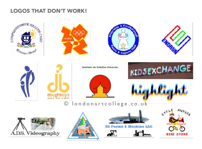
Logos that don’t work
The bad logos I chose pretty much speak for themselves on how bad they are. Most of them aren’t particularly scalable, quality and text is lost at small sizes on some of them. The designers of these logos obviously hadn’t considered this. They’re unattractive, make bad use of colour and typography and in in some instances show something rude that was not originally intended. One wonders how many people saw these logos, such as DoughBoys, Kids Exchange and the two purple figures created for a paediatric doctors and no one saw the glaring issues before the logos were used.
The difference between a good and a bad logo is in the clever and appropriate use of shapes, colours, fonts and graphics. Usage and intended audience must be considered as well as the longevity of the logo and any previous logos or branding that needs incorporating or perhaps leaving out of the final design. Simple designs with little visual noise and that clearly represent the products, services and ethos of the company are ideal. In the first set of example logos the Arla logo is a good example of this. The typography is simple but in a stylised font that suggest a friendly but dependable company. The word Arla is tracked apart slightly to make the word easier to read. It’s white text against a green oval with an additional swish around it that add a little dynamism and movement (Arla is a company that’s on the move). This makes the company stand out more. I suspect an oval was chosen for two reasons. The first is that an oval is a better shape to fit the company name into and the second is that it’s egg shaped and Arla is an International dairy company based in Denmark. Then to finish it off there’s a little yellow flower at the top to add visual contrast and interest but also to say that Arla is a natural company. The green and the flower also hint that the cows whose milk Arla uses eat grass from natural, healthy pastures.
Written by student Charlie Leith
Graphic Design Diploma Course