
Deepthi Horagoda has just completed and passed with distinctions on our Graphic Design in Art Diploma. Deepthi has set a new standard for the final assignment and she has very kindly written about her work below. We hope that you find it inspirational.
————————————————————–
My final assignments for the Graphic Design Diploma Course dealt with package design.I decided to consider real-life client requirements in relation to the assignments and to align my assignment submissions accordingly. This meant stretching both the requirements for the tasks as well as myself, to achieve more than what was expected of me. It also meant that completing this particular unit took longer than any of the other units! I would like to share here my designs for two of the assignments which would be of general interest:
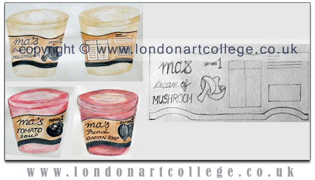
One of the tasks was to produce rough designs for a range of soup brands with one common flavour. As per the brief, the designs have to reflect the market positioning of the brands;designs for a value brand, own brand, leadingbrand and premium brand soup were required. Since most soup manufacturers tend to market several flavours, I decided to design packs for 3 flavours per brand, i.e.cream of mushroom, tomato and French onion soup. As clients’ expectations of a mock-up tend to vary, I did a fairly rough version using traditional media as well as one using digital media.
Package design for a value soup
The design relies on the physical qualities of the packaging material to reflect the brand’s content and image without resorting to costly graphics and printing. The soup tubs are generic, re-usable, transparent plastic take-away tubs. The labels would be printed in black and tone on waxed kraft paper to withstand refrigeration. Alternatively, after printing on plain kraft paper, the labels could be laminated. The colour of the kraft paper eliminates the need for printing background colours onto the labels whilst reflecting the down-to-earth nature of the brand. An appropriate look for the value for money quality of the products.
The design is seamlessly applicable to the entire range, the only points of difference being the illustrations of the chief ingredients and the text:
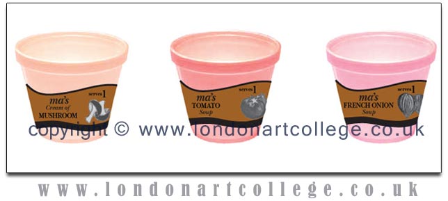
The digital version of the designs:
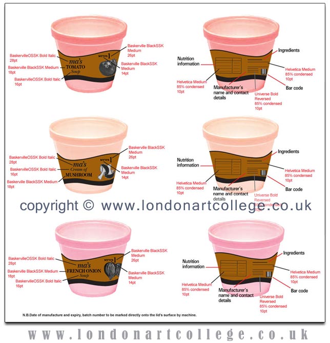
Details of the design elements:
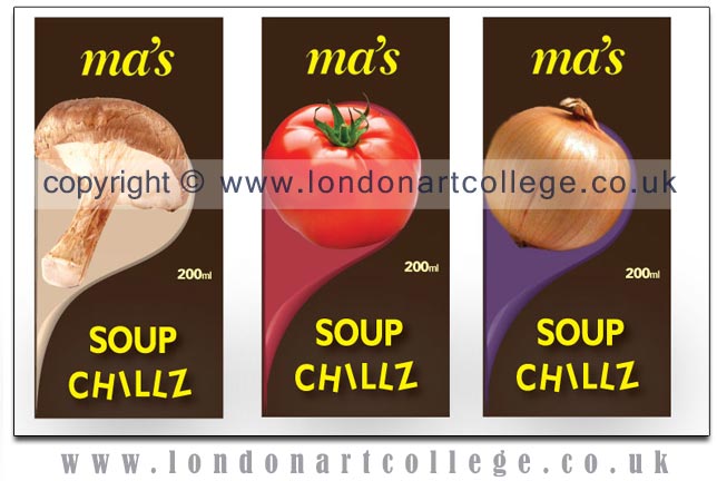
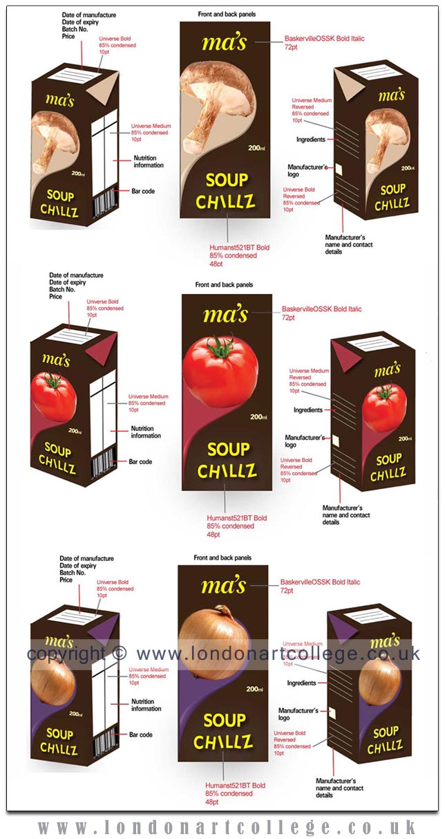
Package design for an own brand soup
The packs have been designed to reflect a ‘nutritious but also cool’ brand image. The flavours are indicated by photographs of the main ingredients, while the haphazardly placed letters in ‘CHILLZ’ signifies movement and a sense of fun. The background colour of all the packs is brown, indicative of the natural origins of the main ingredients. The packaging for this range of ready-to-drink chilled soup are tetra packs. Since single serve tetra packs are generally used for medium priced drinks, the packaging also serves to indicate the price factor. A d-straw would be affixed to each pack for convenience.
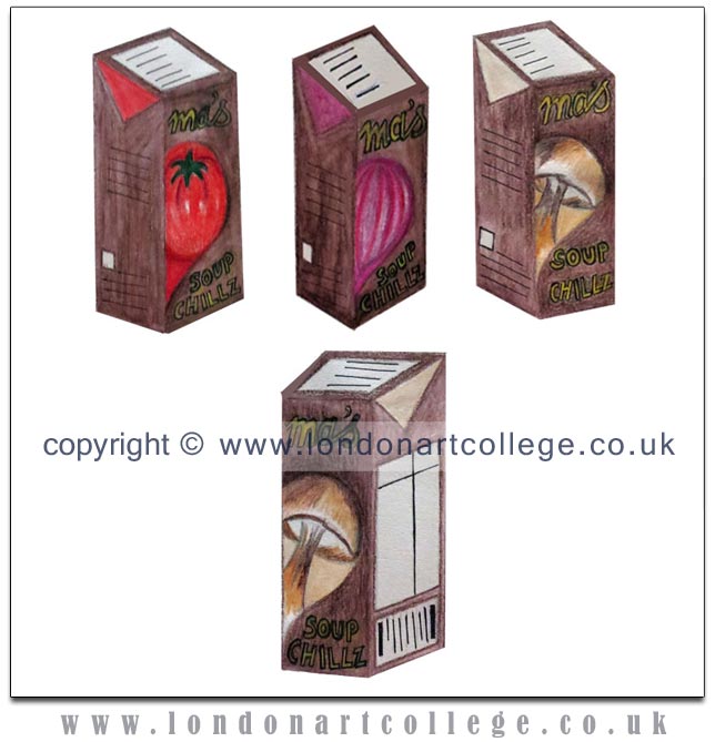
The digital version of the designs:
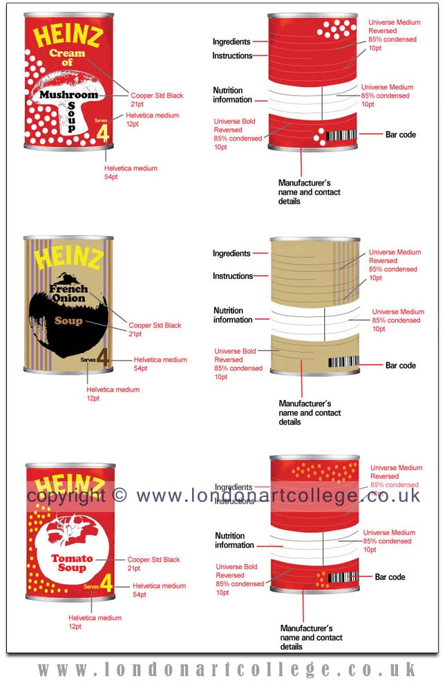
Package design for a leading brand of soup
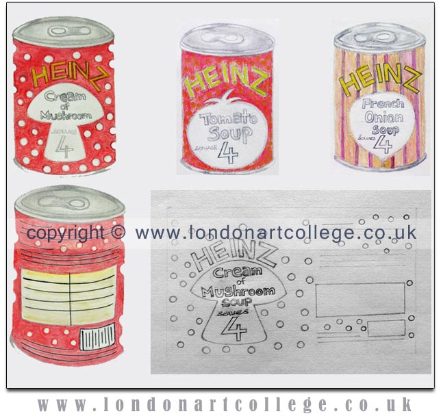
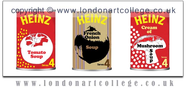
For this exercise I designed a set of labels for Heinz soup cans. Since the brand’s logo is well-known and there is virtually no risk of being mistaken for another brand, I decided to create a markedly different set of labels to the existing range. I wished to highlight the main ingredients of the soups in a whimsical manner, thereby drawing attention to the products whilst amusing the shoppers.
I decided to highlight an element of each main ingredient by incorporating it into the background. Thus, the cream of mushroom label has a red background with white spots, similar to illustrations of mushrooms in story books. The tomato soup label has small yellow spots reminiscent of tomato seeds. The French onion soup label has multiple stripes similar to the lines on an onion’s skin. In keeping with the spirit of the illustrations, the background colours of the labels are those which are normally ascribed to the vegetables. Against these backdrops, a stylized illustration of the main ingredient placed in the center of each label draws attention to the variety of soup within.
The digital version of the designs:
Details of the design elements:
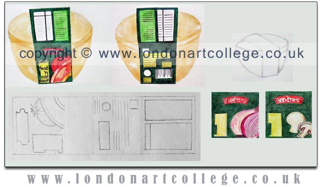
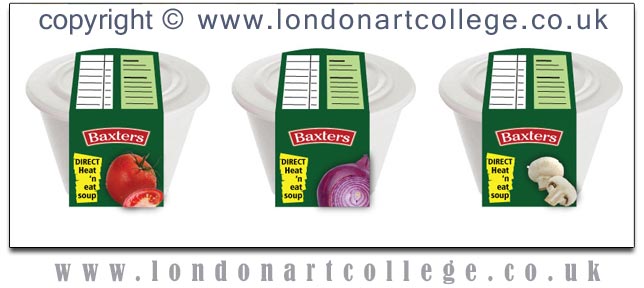
Package design for a premium brand of soup
For this exercise I selected Baxters as the brand for which I would design a range of labels.I researched the brand’s current range of soup products as seen online and decided to focus on an environmentally friendly design.
Since this is an open brief with no specific indications about the packaging material, I selected a bagasse tub with a lid. I felt that an easily biodegradable container would encourage regular, repeat purchases as against a reusable container which would eventually pile up. I decided to restrict all of the product information to a sleeve made of recycled paper board, thereby adding to the eco-friendly nature of the product.
The principal design panel would attract the attention of shoppers through lush, high-resolution photographs. The fact that the soup container can be heated directly and the soup consumed from it is highlighted on the left side of the principal design panel. The area atop the lid would contain information about nutrition and preparation. The product’s environmental impact would be highlighted on the rear panel of the sleeve. The background of the sleeve is a dark shade of green, suggestive of freshness:
The digital version of the designs:
Details of the design elements: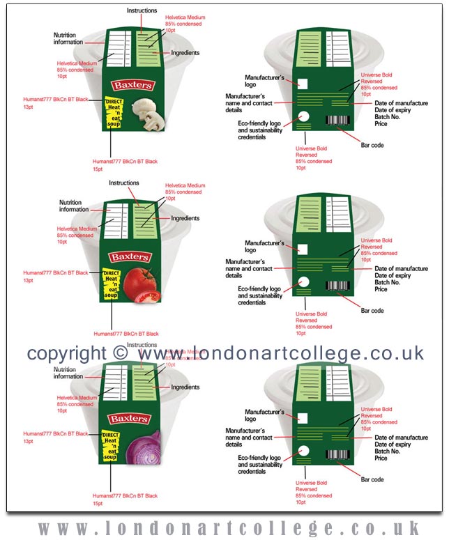
The Final Package Design Task
The final assignment compels the student to combine all that was learned in the unit. The task required creating a name for a new brand of aftershave/perfume, teabags/coffee, a fizzy drink or motor oil and designing the packaging and surface graphics for the product.
Since I reside in Sri Lanka, a major tea exporting country, my natural choice was a design for a caddy of organic tea bags. As part of my research, I studied over 150 different tea packs, apart from reading about various aspects of tea cultivation, processing and packing. Ultimately I decided to design a pack for Japanese-style organic green tea which is sought after for its health-endowing benefits.
After reading about the different types of green tea which can be produced locally I decided to design a pack for a Japanese-style Sencha organic tea. I collected factual information from the website of the Sri Lanka Tea Board (www.pureceylontea.com), including graphics of certification logos. I also collected information from specialist websites on the correct way to brew Sencha tea, medicinal and nutritional properties as well as post-use. Consequently I found that whole leaves yielded the best taste. According to the same sources, whole leaf teas packed in pyramid-shaped bags enabled the full flavour of the tea when brewed. This led to research on pyramid-shaped tea bags made of eco-friendly materials.
The next task was to select a brand name for the tea. I decided to use a Japanese word which would convey the idea of ‘pure’. The name also had to be short and memorable. The task proved easy enough, as the word for ‘pure’ in Japanese is ‘kiyoi ’.
Thereafter, I considered the most suitable raw material and the type of packaging. According to theFragrant Leaf website (www.thefragrantleaf.com), the enemies of tea are ‘air, light, moisture and odours from other foods.’ Obviously, protecting the contents of the package was important. At the same time, the environmental impact and re-usability also had to be considered. I was trying to decide between a metal tea caddy and an eco-friendly paper canister. Unexpectedly, the entire design changed when I saw an old Colman’s Mustard tin upcycled as a clock on a website. Subsequently I also saw some old tea caddies which had been given a new lease of life as clocks.
The decision to incorporate a clock into the pack made me choose a metal (tin) caddy. I was wondering whether the clock dial should be painted directly onto the surface of the caddy and the hands of the clock inserted through a small opening. Searching online yielded details of several types of tin caddies manufactured with a see-through window on the front panel. One manufacturer based in the UK clarified my queries. Having researched about clock kits and DIY clocks, it was clear that a clock kit could be glued to the interior of the see-through window. I even found a manufacturer in China who was manufacturing candy tin caddies with built-in clocks.
Design Rationale for Tea Bag Caddy with Alarm Clock
Target market
This package for a brand of organic Sencha green tea has been designed for health-conscious males and females aged thirty years and above. These are discerning tea drinkers who care about the environment and who are willing to pay for an ethically produced, premium quality tea.
Brand image and promise
The brand is portrayed as part of a life-style choice which values living in tune with nature. Its unique selling point (USP) is the fact that it is 100% organically grown, whole leaf Sencha green tea in bags from the world’s only ozone-friendly tea producing nation. The brand promises a pleasurable and healthy life-style habit.
Environmental impact
Both the pack and the contents within, reflect concern for protecting the environment. The pack has been designed for re-use, either to store tea or some other items like biscuits. Ultimately, it can be recycled and re-used as metal packaging raw material. Likewise, the tea bag tags are not affixed with metal clips or glue. The tea bags are made of Soilon, a fully biodegradable mesh made of corn starch. In order to minimize the use of raw materials and cost, the tea bags will not be wrapped in individual sachets. Instead, the fifteen bags will be placed inside a re-sealable, transparent eco-bag which is biodegradable.
Design elements overview
Since Sencha green tea originated in Japan, the entire design incorporates Zen motifs and philosophy, reflecting the product’s essence. The caddy’s surface graphics focuses the attention of shoppers on the brand experience.
The brand’s unique environmental credentials are highlighted by incorporating the ‘Ozone friendly’ logo onto the lid’s seal. The brand’s logo is embossed on the lid as a permanent reminder of the product. The lid itself is a bright hue of green, cueing the product’s nature as well as its ‘green’ origins. Apart from the lid, the colour of the caddy’s body is under-stated in keeping with the rustic origins of the product. A subdued photograph of two tea leaves and a bud in the background has been used on all sides of the caddy other than the rear, to create a subtle reminder of the product.
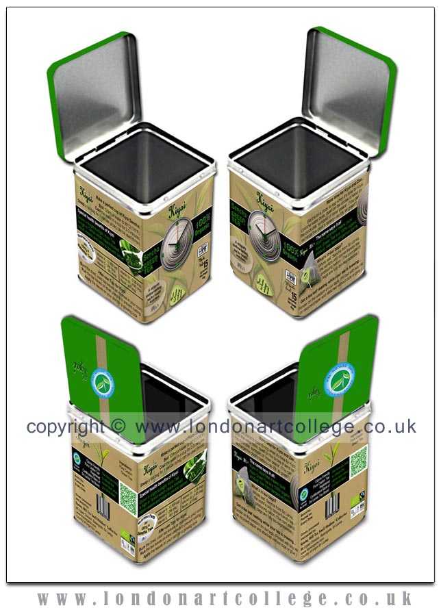
A black colour band printed across the entire width of each side of the caddy, acts as a focal point where important aspects of the product are highlighted. An arresting graphic pertaining to the product and concise copy set in reversed type are used to compel the prospect to read. The brand logo is prominently displayed on each of the caddy’s sides, ensuring memorability and preventing the prospect from confusing the pack with any other brand.
Design elements — principal design panel
The pack aims to encourage the target consumers to continue a healthy habit. The alarm clock built into the principal design panel (PDP), acts as a reminder to take a break to brew and sip a cup of Kiyoi Sencha. The large, green stylized heart at the center of the clock-face, as well as the smaller ‘hearts’ used to indicate 3, 6, 9 and 12 draw attention to the product’s health benefits and also that it’s a ‘green’ product. Thus, the alarm clock acts as a reminder of both the brand and the product experience on a daily basis, strengthening brand loyalty in a warm-hearted manner. What’s more, the clock ensures that this pack will be retained as a practical yet elegant fixture at home or the workplace, long after the contents are consumed. 
The positioning of the brand logo, the name of the variety of tea and the text, ‘100% organic ’ around the clock face ensure that these vital points are noticed — even by a casual shopper. At the bottom left of the pack, a photograph of a tea bag being infused in a porcelain Japanese tea cup, highlights the user experience, together with the copy, ‘A uniquely mellow-tasting tea for health watchers’. The copy, ‘Your tea leaves readings inside’ in script type on the tea tag in the photograph promises a novel experience awaiting the prospect. The Lion of Ceylon trademark which is allowed only on pure Ceylon tea is positioned prominently on the right side of the PDP, below the black band. The fact that the tea is presented in whole leaf form — a point of significance to discerning tea drinkers — is positioned directly beneath the lion symbol.
Design elements — right side panel
Turning the caddy to the right reveals the symbolic and functional aspects of both the package and the product. Each aspect is preceded by an arresting caption set in bold type, enabling quick and easy reading. The copy is kept concise but intriguing, helping the prospect to realize the unique value propositions offered by the product. The environment-friendly aspects are bracketed for reading convenience and clarity.
Two bold images, placed diagonally opposite each other against the black band act as visual cues to the copy. The type wraps around the images of the circles of sand and the pyramid-shaped tea bag, accentuating the outer shape of the two objects. The main space within the black band is used to highlight the origins of the brand name and what it signifies in relation to the product.
Design elements — left side panel
The regulatory text pertaining to preparation instructions and nutritional information appears on this panel. As per the overall design strategy, the information is presented from a benefits-driven angle, in an easy-to-read, attractive layout utilizing bold graphics and type.
The top part of the panel is used to provide instructions on making a perfect cup of Kiyoi Sencha. The three steps are laid out in a stepped formation. The words for the action required for each step, i.e.Boil, Cool and Steep are emboldened for quick reading. The main focal point of this side of the pack (like the others) is the black band. A teaspoon filled and surrounded by green tea leaves cut out in the form of a stylized heart is placed on the right side of it. The remainder is used to highlight copy on the brand’s health benefits, set in green for added emphasis. Placed diagonally opposite to the heart shape and underneath the band is an image of a Japanese-style white porcelain tea cup. The image is used as a visual cue to the mandatory nutrition values chart with the text, ‘Nutrition facts per 100mg of Sencha Tea’ set atop in high contrast black bold type.
The bottom part of the panel is used to offer information about post-use for the tea leaves. Here again, the verbs of the text have been emboldened for quick reading.
Design elements — rear panel
The rear panel of the caddy presents the regulatory information about the product such as country of origin, manufacturer’s details and barcode in a novel and engaging manner. The barcode forms an elegant plant holder for the two leaves and bud of a tea plant which is the focal point of the panel.
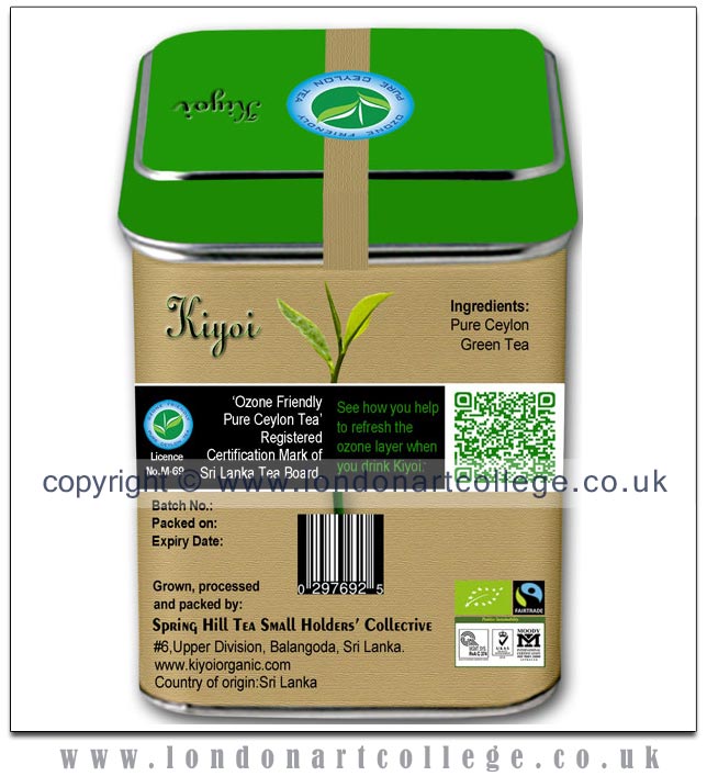
The horizontal black band running across the width of the panel in front of the tea plant acts as a visual screen for two branding elements. The left side is used to display the ‘Ozone friendly pure Ceylon tea’ logo and regulatory text, as well as the licence number awarded to the brand. The right side of the black band is used to display a quick response code (QR code). When scanned with a smartphone running a QR code reading app, the code links to the Sri Lanka Tea Board’s web page on how the Sri Lankan Tea Industry helps to protect the ozone layer. The QR code’s design was specially generated to contain leaf-shaped elements. Printed in green, the code design blends harmoniously with the rest of the pack’s design elements.
The manufacturer’s details are laid out at the bottom of the panel on the left, whilst logos certifying the organic origins of the product are placed prominently on the right.
Use of type for principal design panel
The logotype for the brand name was selected to reflect the curled ends of processed tea leaves. The same typeface was used for ‘Whole leaf’ on the principal design panel, as well as for the text on the tea bag tag therein. The product descriptor was set in a font comprising organic-shaped characters. In order to visually differentiate between the variety of tea and the type of tea, ‘Sencha’ was set in upper and lower case whilst ‘Green Tea’ was set in upper case using the same font.
Concepts, designs and assembling of related elements
Tea Bag Tags — Concept
In order to to extract the beneficial qualities of Sencha green tea, the leaves have to be brewed for one minute. People generally do one of three things while waiting for their tea to brew:
- Attend to other work.
- Use the ’phone.
- Stare at the cup.
This waiting time can be used to engage in getting a ‛tea leaves reading’ with a new twist. Whereas traditional tea leaf reading (tassology) is done after the tea is consumed, in this case the ‛reading’ is done prior to consuming the tea.
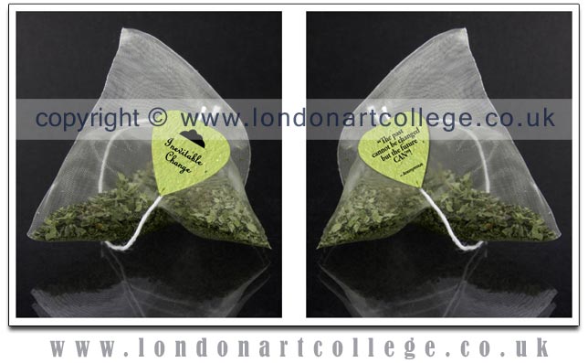
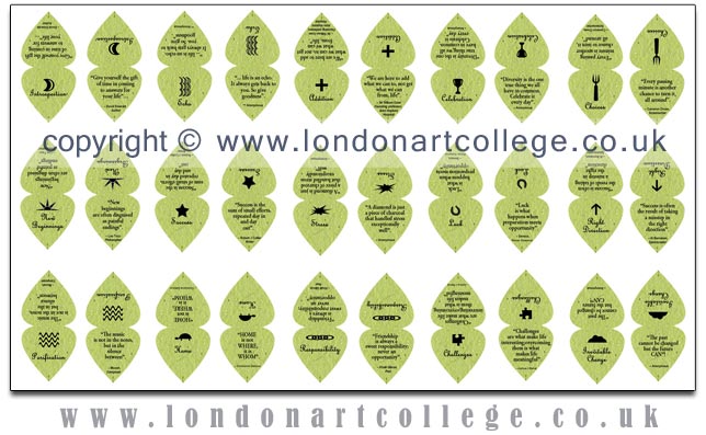
Each tea bag has a green colour paper tag folded in two and cut in the shape of a stylized heart. The top side of the tag has a symbol such as a horseshoe or a cup printed on it. These are actual symbols used in tassology. The ‛interpretations’ of the symbols appear on the other part of the tag, in the form of quotations. These have been carefully selected to uplift as well as instruct the reader. Whereas traditional tea readings compel the reader to come up with a visual interpretation, in this case the reader can devote his or her time to meditating on a thought behind the symbol, literally. Inevitably, it prevents yet another chore being performed while the tea is brewing.
Together with the health benefits of consuming Sencha green tea, the very ritual of brewing the tea can be therapeutic, albeit without the elaborate nature of a Japanese tea ceremony. The heart-shaped green coloured tags also act as a visual reminder that drinking Kiyoi Organic Sencha Green Tea is good for one’s heart. Each tea bag would have a tag with a different ‛reading’. Since each bag can be used thrice, this gives a chance for the message contained in the ‛reading’ to be re-pondered. Some may use the opportunity to recall what they read earlier in the day.
Tea Bag Tags — Design
Market research indicates two types of tea bag tag designs in use;one has a brand name printed on the tag, whereas the other type is merely coloured shapes. The tags for Kiyoi Organic Sencha Green Tea would be die-cut in the shape of stylized hearts out of green colour recycled paper. The symbols on the tags are cartoon-style line illustrations which together with the text of the quotations would be printed in black using soy-based ink. Each caddy would have fifteen tea bags with a different tag on each. The tags would be attached manually by threading and knotting with a cotton string.
Point-of-Sale (POS) Display Unit — Concept
Specially designed POS units displaying 24 caddies of Kiyoi Sencha with alarms set to ring at 30 minute intervals would be installed at supermarkets. The first alarm would ring at 9:00a.m. and the sequence of alarms would continue until 8:30p.m. Apart from the visual movement of the seconds hands of the clocks, the sound of the alarm will attract the attention of shoppers. The caddies used for display would not contain tea bags. The caddies for sale would be placed close to the POS display unit. These would not have activated clocks, as transport costs would increase due to the added weight of the batteries. Once the promotion is over, the display packs would be sold as collectibles and the income donated to a charity espousing environmental causes.
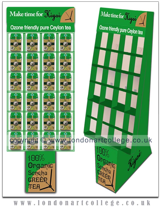
Point-of-Sale (POS) Display Unit — Design
A sloping display rack made of recycled board, comprising 24 pigeon hole type of compartments. Each compartment would display 1 caddy. The racks would be flat packed, enabling cheaper freight costs.
Alarm Clock — Concept
A slim, light-weight alarm clock powered by 1 AA battery. The battery compartment would have a plastic cover, preventing contact with the tea bags. The clock-face would be printed on paper and inserted behind the acrylic dial.
Alarm Clock — Design
The clock-face paper design is based on Zen meditation sand circles known as Mizumon or ripples of water. Usually, a rock or a stone is placed at the center, representing a frog jumping into the water and creating the ripples. In the clock-face paper, a large green heart is positioned at the center and is encircled by 4 smaller green hearts, placed on the 3, 6, 9 and 12 O’clock positions.
Deepthi Horagoda
Graphic Design Diploma
Thank you Deepthi for this wonderfully informative blog post. The content is so well considered and stands as an outstanding example of how to craft a design, from both creative and technical perspectives. I am sure that your work will inspire many students, so thank you for sharing it with us.