
I asked Jon, a student who is currently studying with Maggy Roberts on the Illustrating children’s books, if he would write about his sink city painting for the blog. I was very interested to hear how he created the piece using both traditional and digital media. Jon has written about it below and we hope you enjoy it!
————————————————————–
Sink City – Assignment 2 Children’s Book illustration Diploma
My entry for assignment 2 took about 3 months to finally complete as Sink City kept getting knocked down and rebuilt. I knew I wanted to do something detailed but finding the right approach was what eluded me for sometime until I basically took everything I had doodled, scanned it all into Photoshop then played around with it till I had a few compositions that i liked. I chose one, printed it out at A2 then using a lightbox redrew all the buildings to the right scale with pen and ink. Then I scanned that A2 drawing in (in 4 sections) got them all lined up in Photoshop to make a new A2 document then chopped everything up and rearranged it till I had what I was after. I later drew some extra people, a plane and other bits and pieces to add to the mix until I had a finished ink drawing ready to be coloured.
I had originally wanted to do a traditional line and wash drawing for this project but it got so big and detailed I didn’t feel like I could do it justice with watercolour, not to mention having to redo the ink drawing if I fudged it up (time is not something I have a lot of at the moment!) so I opted for digital colouring
I find its always a good idea to have an idea of what you want to achieve in Photoshop otherwise you can end up meandering down different avenues trying various techniques and variations and ultimately not getting anywhere which is, needless to say, what happened to me.
I found it hard to get the colours right as it needed to clearly show the line but also split the different elements up so they can be clearly read. In the end I went for a basic brown/orange for the background and bright colours for the figures to make them pop out. I think it works but looking at it now I still want to change bits and pieces…but assignment three is pulling at my sleeve trying to get my attention so I best go.
Thanks for reading this, its been an honour and a pleasure to be asked to write about it for the Course Blog
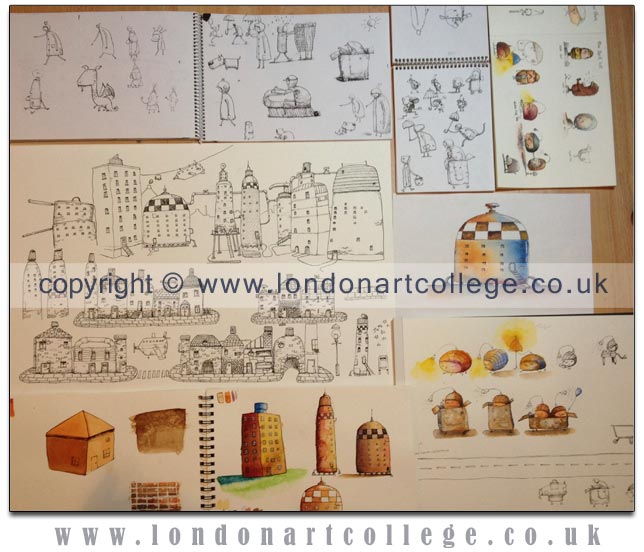
Jons Preparatory studies. So important when collating and composing any kind of painting or illustration.
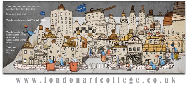
The full final illustration.
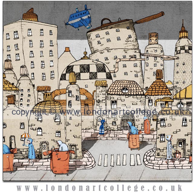
A detail of the illustration.