‘Time After Time’ – A Book Cover Design For A Science Fiction Novel
Written by Deepthi – Graphic Design Student.
This assignment was what is known as an ‘open brief’. Apart from the book’s title and the author’s name, the only information we were given was a very limited outline of the story. It was about a successful but bored middle-aged scientist who discovers a way to travel through time to a happier state of existence. Although initially everything goes well, complications set in we were told. We were also told that the author was not well-known and hence his name was not the most important element on the cover. In other words, we were expected to give full rein to our imaginations in tackling this assignment.
Technically, there were a few guidelines which we had to follow. To begin with we had to colour the outlines of the illustration using sepia coloured ink. Thereafter, we had to use poster paints to colour the illustrations. As per a real-life brief, the dimensions of the book’s front cover and spine were also provided. The size of the cover played a pivotal role in the final outcome of the design as I will explain later.
The book cover had to attract the interest of prospective readers as well as ‘to inform and entertain’. It also had to be visible from a distance across a room, much as in a bookshop. In order to do all that I had to come up with a bold and arresting design. The typography was also vital to the overall effectiveness of the design;my choice of typeface would have to be legible while conveying the essence of the book’s story at the same time.
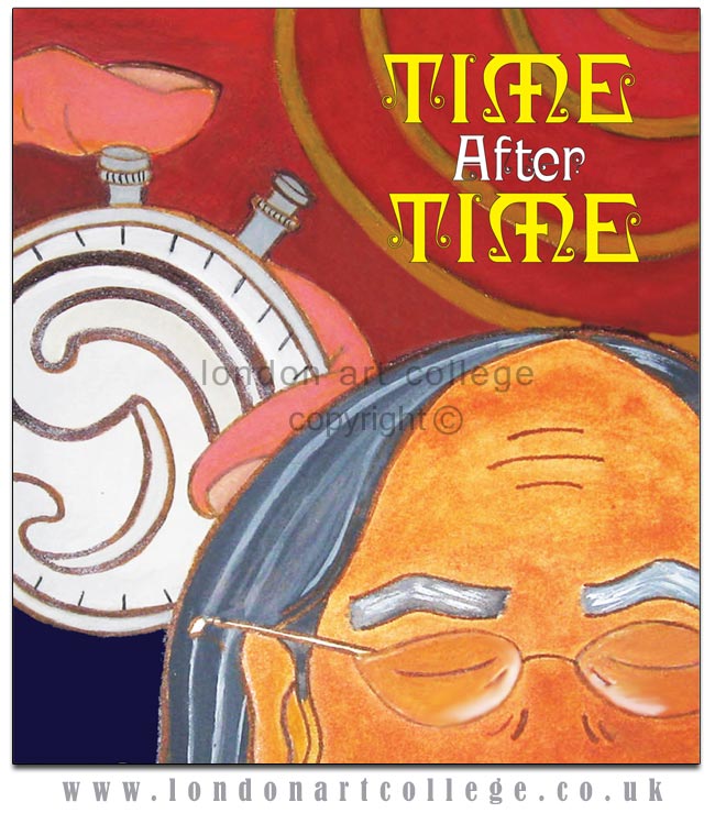
Above – Detail of Book Cover
Given all these considerations as well as the advice in the course materials I decided to use large, bold illustrations. The essence of the story, i.e. time travel and regeneration provided the basis for my design. Being a design for a science fiction novel I felt that ‘Time After Time’ provided the opportunity to combine realistic illustrations with abstract motifs.
Early on I had decided to use a life-sized hand holding a stop-watch for the front cover. However, given the dimensions of the cover, this proved impractical. Thereafter I settled on drawing a close-up image of a life-sized thumb and fingers encircling a stop-watch. I felt that the concept of time measured in terms of life and regeneration could be depicted by an embryo drawn in abstract style, curled up within the confines of the stop-watch. I decided to retain an earlier design of a middle-aged man’s face in the foreground as I felt that a human face would cause even a casual viewer to take a closer look. The golden coloured rings to the right of the stop-watch symbolize the vibrations emanating from the stop-watch and also serves to guide the eye to the title of the book. My design decisions seem to have been proven effective by the comments of our course tutor, Mrs.Weaver who in her critique has commented:
“The composition of the front cover image is effective. You have created a sense of depth with the foreground middle-aged man leading the eye in towards the stop-watch and the circular golden rings beyond. The fact that the middle-aged man’s face is only partially shown adds impact to the design”.
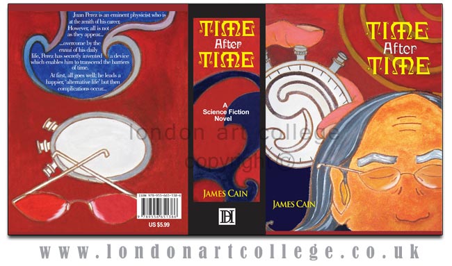
The title of the book was set in a free font known as Ringlet Black which was downloaded from the internet. The word ‘Time’ was set in upper case as the letter ‘M’ in this font has a horizontal stroke running across the vertical middle stem giving the appearance of a cross. I felt that this accentuates the mysterious nature of the story while endowing it with a slight gothic aura. ‘After’ was set in white in upper and lower case (title case) in order to create a contrast with ‘Time’ and also to highlight the repetitive nature of the phrase ‘Time After Time’. The type treatment of the title on the spine of the book is identical to that on the front cover. The embryo-like design on the front cover was incorporated into the design on the spine as well.
The rear cover, like the front cover combines realistic visuals with the abstract. The synopsis of the story is screened behind what appears to be waves. The waves are a subliminal cue to the often quoted “Time and tide wait for no man”. The buttons on the stop-watch are dimmed unlike the one on the cover as time has ground to a halt and the watch is powerless. The middle-aged man’s spectacles which have been placed atop the stop-watch appear to be rose-tinted, thereby suggesting an element of escapism from reality which forms the core of the book’s story.
Above – The Finished Book Cover
The background colours of the cover and spine also required careful consideration as it had to create the right ‘feel’ of the story without distracting attention from the more important elements. After trying out several colour combinations on copies of the drawings I finally decided to use a combination of blue, black and red. Our course material stated that variety in tonal quality was necessary to create depth and interest. I am happy that my efforts paid off as pointed out by Mrs.Weaver in her critique:
“Your colour choices work effectively, bringing a boldness to the layout. The use of dark blue in the lower left corner of the front cover allows the stop-watch and man to stand out well. All tonal values have been well considered. Your final piece is well presented. I love the vibrancy of the particular tones of each of these colours you have chosen. The painted finish is completed to a good standard and overall the result is an eye-catching, colouful and striking book jacket”.
I would like to take this opportunity to thank Mrs.Weaver for her encouraging and insightful guidance. I would also like to add that unlike the other LAC art courses which are more about drawing and painting techniques and discovering one’s personal style, the Graphic Design Diploma requires a different approach from the student. One needs to carry out a lot of research and experiment with different approaches and techniques before attempting the assignments in the study units. What’s more, critical thinking is a must, as graphic design is essentially tied up with the commercial world in one form or the other and as such, the end use of our designs has to be borne in mind at all times. Personally for me, that’s one of the attractive challenges of graphic design!
Written by Deepthi – Graphic Design Student.


