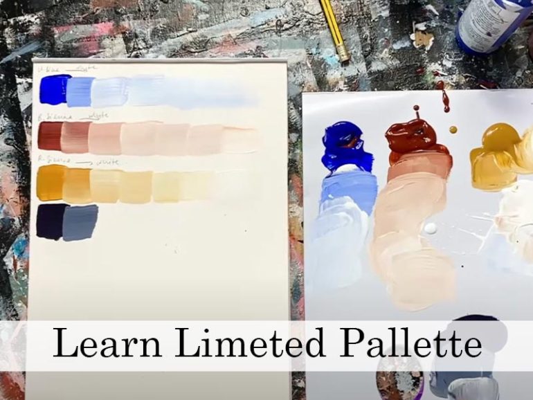
If you have ever found your paintings looking a bit muddy or unsure how to make your colours work together, this is a great exercise to try. Using a limited colour palette is one of the most effective ways to improve your colour mixing and create artwork that feels unified and balanced.
Limiting your colours might sound restrictive, but it actually gives you more control and often more creativity. It forces you to make thoughtful decisions, to mix instead of reaching for another tube and to really understand how colours relate to each other. It’s a useful habit across all painting styles and mediums, whether you’re working in watercolour, acrylic, oils or even coloured pencil.
Today we are focusing on how to work with just a few colours – two or three at most, to create a finished piece that feels rich, harmonious and well-planned.
Why Use a Limited Palette?
When you reduce the number of colours on your palette, everything you mix shares a common thread. That’s what makes a limited palette so effective it naturally creates colour harmony.
It also helps to avoid that dull, lifeless look that sometimes happens when you accidentally mix too many different pigments together. By restricting your options, you reduce the chances of colour clashing or creating ‘mud’, and you give your painting a clear visual identity.
On top of that, working with fewer colours is often quicker, more efficient, and more cost-effective, perfect for sketchbook studies, small pieces, or when you’re travelling or painting on the go.
Take a look at this blog post which might be useful – Painting with a Limited Pallet – How and Why.
How to Choose Your Colours
You can choose any combination of colours, but a good place to start is with three primary colours — one red, one blue, and one yellow. Try something like:
- Lemon Yellow
- Ultramarine Blue
- Cadmium Red (or Alizarin Crimson if you want cooler, more muted tones)
You could also try a more earthy trio:
- Yellow Ochre
- Burnt Sienna
- Payne’s Grey or Indigo
You can add white to help with tinting and lightening your colours, but it’s not essential depending on your medium.
The idea is to mix everything you need greens, oranges, neutrals, darks from this small starting set. You’ll soon notice how much you can actually do with so little.
Practice Prompt: Create Your Own Limited Palette Study
Choose three colours and challenge yourself to complete a small painting or sketch using only those colours (plus white, if you want). Try painting a simple subject like:
- A single piece of fruit
- A flower or leaf from the garden
- A favourite mug or jug
- A shell or natural object from your sketching box
The subject can be anything what matters is how you mix your colours. Focus on how you create contrast, mood and variety using subtle shifts in temperature and tone.
Make a note of which colours you chose and how you felt about working with them. Did you find it easier or harder than using a full palette? What surprised you about the results?
Final Thoughts
Limiting your palette isn’t just a technical exercise, it’s a creative one. It encourages discipline, builds your confidence with colour mixing, and often leads to more expressive, cohesive artwork.
So next time you feel stuck or overwhelmed by choice, try starting with just three colours. You might be surprised by what you can create and how much more unified your painting feels in the end.
If you would like to receive a roundup of all of our blog posts once a week to keep you inspired in your inbox, why not sign up to our newsletter. You can access our sign up at the top of our page. If you are a London Art College student and you would like your artwork featured here, drop us a line at any time.

