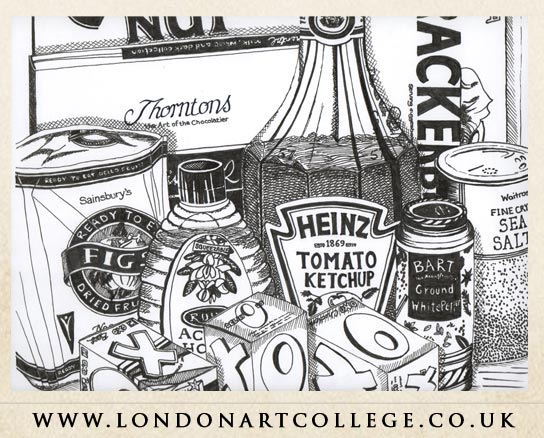
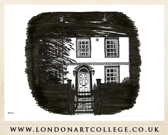
I was delighted with the outcome of these two pieces of work from Shirley Carter as they combine a number of aspects of learning from the Art in Graphic Design course. Students have to choose a minimum of one piece of work from four options. Shirley opted for a still life made up of kitchen packaging, as well as drawing an object on a dark background, demonstrating contrast.
The still life scene is bursting with interest through a selection of different shapes, sizes and materials. Shirley has used a range of pen and ink techniques to capture the attributes of each shape, paying particular attention to tonal values. There is a good range of contrasting tones from dark to light and the lettering has been drawn very carefully. Cropping the composition to zoom in on the packaging with very little of the surroundings showing creates a scene full of impact.

Shirley’s second piece of work demonstrates contrast effectively. Using the solid dark background allows the form of the house to stand out, eliminating the need for outlines. She has continued this idea in the foreground, showing the gate and wall in silhouette form. There is a super sense of texture included in this study, with the shadow of a tree covering the left hand side of the house and picking out some of the detail of the brickwork and windows. Well done, two super pieces of work!
Written by Vanessa Weaver – Graphic Design Tutor

